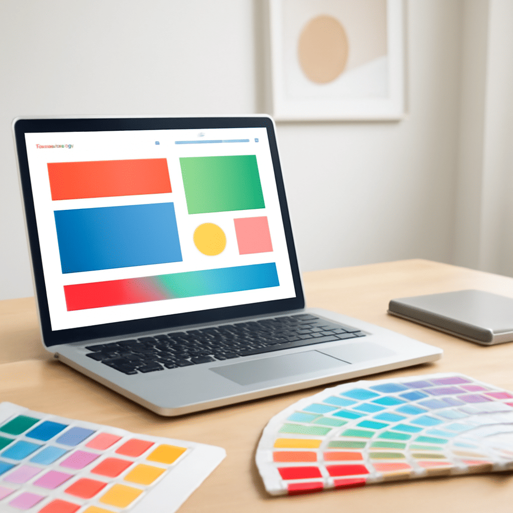
Understanding how color influences perception is crucial in creating appealing online spaces. Colors can evoke emotions, transmit messages, and even sway user behavior subconsciously. Let's explore the fundamentals of this vibrant science and see how it comes to life in screen-based design.
Color theory is a framework that blends art and science, focusing on the use of color in visual composition. It consists of primary, secondary, and tertiary hues. The primary hues (red, blue, yellow) act as the groundwork, and with their combination, other hues are formed. Secondary hues (green, orange, purple) arise from mixing pairs of primary hues, while tertiary hues result from blending a primary with a neighboring secondary hue.
In design, color schemes are typically formed using these hues, and they include monochromatic, complementary, analogous, triadic, and tetradic palettes. Each palette serves a distinct purpose:
-
Monochromatic: Using one hue with varying shades and tints, this scheme offers a cohesive and calming experience.
-
Complementary: By utilizing two hues opposite each other on the color wheel, this scheme creates vibrant contrast and draws attention.
-
Analogous: Involving three hues next to each other on the wheel, these schemes evoke harmony and comfort.
-
Triadic: Comprising three evenly spaced hues on the wheel, it results in a lively and colorful arrangement.
-
Tetradic: With four hues arranged into two complementary pairs, this palette provides plenty of variety and depth.
Color contexts impact the viewer's perception. For instance, warm colors such as red, orange, and yellow can invoke feelings of warmth and energy. On the other hand, cool colors like blue, green, and purple tend to calm and soothe.
In practice, applying these principles to design involves not only choosing colors that align with the intended message but also considering their cultural connotations and accessibility. For instance, red might signify danger in one culture but positivity in another. Ensuring sufficient contrast for legibility ensures the space is accessible to all, including those with visual impairments.
One increasingly popular tool in this domain is color psychology, which examines how different hues affect human emotions and decision-making. For instance, blue is often associated with trust and stability, making it a frequent choice for services requiring reliability. Yellow, being the most visible hue, is great for instigating attention and cheerfulness.
To create a cohesive visual space, it's crucial to maintain consistency in using colors across various elements such as text, buttons, and backgrounds. The strategic use of this consistency can guide the viewer’s focus and enhance the interactive experience.
Ultimately, the art of effectively integrating color into design is a thoughtful process that combines theory with intuition, culminating in designs that are not only visually appealing but also convey clear and meaningful messages to the viewer. Understanding and leveraging the elements of hue, contrast, and psychology can transform a digital space from mundane to memorable.