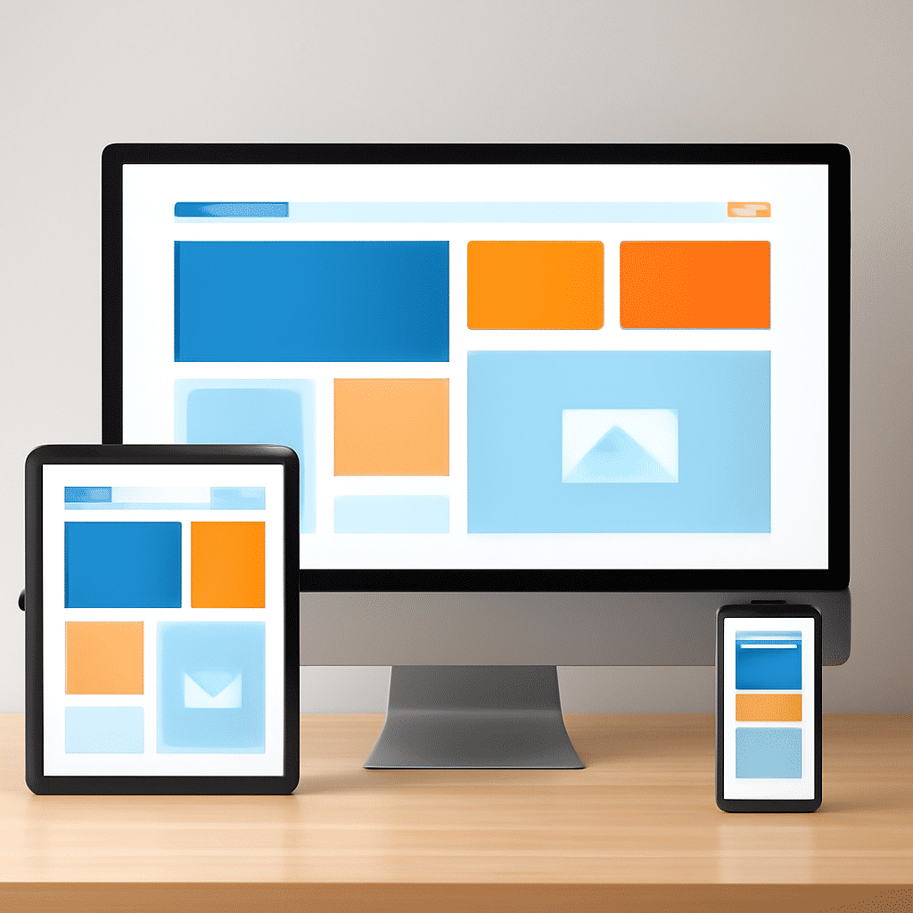
In today's fast-paced world, where people connect through a myriad of devices, flexibility becomes crucial in the realm of website development. This necessity is best fulfilled through adaptable design, ensuring that site interfaces remain user-friendly regardless of the gadget being used.
The core idea behind this approach is to provide accessibility whether one is navigating on a handheld device, a tablet, or a traditional desktop computer. By focusing on fluid grids, flexible images, and media queries, developers can create layouts that respond to the user’s device environment, enhancing the experience and ensuring consistency across various platforms.
Fluid grids form the backbone of adaptable design. Unlike fixed grids, which rely on set pixel dimensions, fluid grids offer dynamic sizing based on percentage rather than absolute values. This ensures that content stretches or shrinks in harmony with the browser size, delivering a seamless visual presentation.
Alongside fluid grids, flexible images contribute significantly to responsiveness. Images are sized relative to their containing element, allowing them to adapt as that element resizes. This technique prevents images from overflowing their containers, thus maintaining visual integrity and loading efficiency.
Equally vital are media queries—an essential tool in the developer’s toolkit. Media queries allow designers to apply distinct styling rules based on the attributes of the user’s display, such as screen width, resolution, or orientation. This means a site can sport different layouts for vertical or horizontal perspectives, making the transition between devices smooth and cohesive.
Moreover, adaptable design promotes improved performance and speed. By optimizing the loading of images and other resources based on the user’s device, sites can minimize data usage and loading time, which is particularly beneficial for those accessing the web on limited data connections.
Another valuable aspect is its positive impact on accessibility. An accessible website caters not just to the average user but also to individuals with varying abilities, ensuring everyone can interact with the site effortlessly. Semantic HTML and strategic CSS choices allow screen readers and assistive technologies to navigate pages more efficiently, creating a user-centric digital space.
In summary, embracing a flexible approach to web design is no longer just an option—it’s a necessity for catering to today’s diverse audience. By incorporating fluid grids, flexible images, and media queries, developers can create adaptable websites that provide a harmonious, efficient, and user-friendly experience. This ensures that every visit to the site—regardless of the device used—is smooth, engaging, and visually pleasing.